A collection of images and other items from Disneyland, theme parks and other amusement parks. Also look for images and items I find interesting, amusing or both.
Wednesday, May 23, 2012
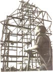
it's a small world part 1
Today and Tomorrow I will be showcasing a set of slides featuring it's a small world. First up is the exterior with a great view of the original sign and color. I love the space ship lights.
Next up is a view of the lovely facade from one of the boats.
Final image for today is the sign and building at night.
Rolly Crump told me a story one time of how they were finalizing whether the facade should be painted multi-colors (to ephasize muti-cultures and nations) or gold & white (to represent innocence & purity). The head of the paint shops at Disneyland advised INNOCENCE & PURITY semmed to have a stronger meaning to the attraction. Rolly said he was full-of crap....the paintshop director knew it would be a pain to maintain the multicolor scheme as opposed to just white and gold!!
I too, love the first picture...the trees on the berm, especially to the left, really create a beautiful picture! Even the expansive slurry walkway doesn't bother me, because the facade is just so gorgeous.


4 comments:
I like the image of the lit blue "Presented by Bank of America" sign.
The Unobstructed view in the first pic is priceless. No toy shop or other junk to ruin the facade.
Rolly Crump told me a story one time of how they were finalizing whether the facade should be painted multi-colors (to ephasize muti-cultures and nations) or gold & white (to represent innocence & purity). The head of the paint shops at Disneyland advised INNOCENCE & PURITY semmed to have a stronger meaning to the attraction. Rolly said he was full-of crap....the paintshop director knew it would be a pain to maintain the multicolor scheme as opposed to just white and gold!!
I too, love the first picture...the trees on the berm, especially to the left, really create a beautiful picture! Even the expansive slurry walkway doesn't bother me, because the facade is just so gorgeous.
Post a Comment